 Join The Club


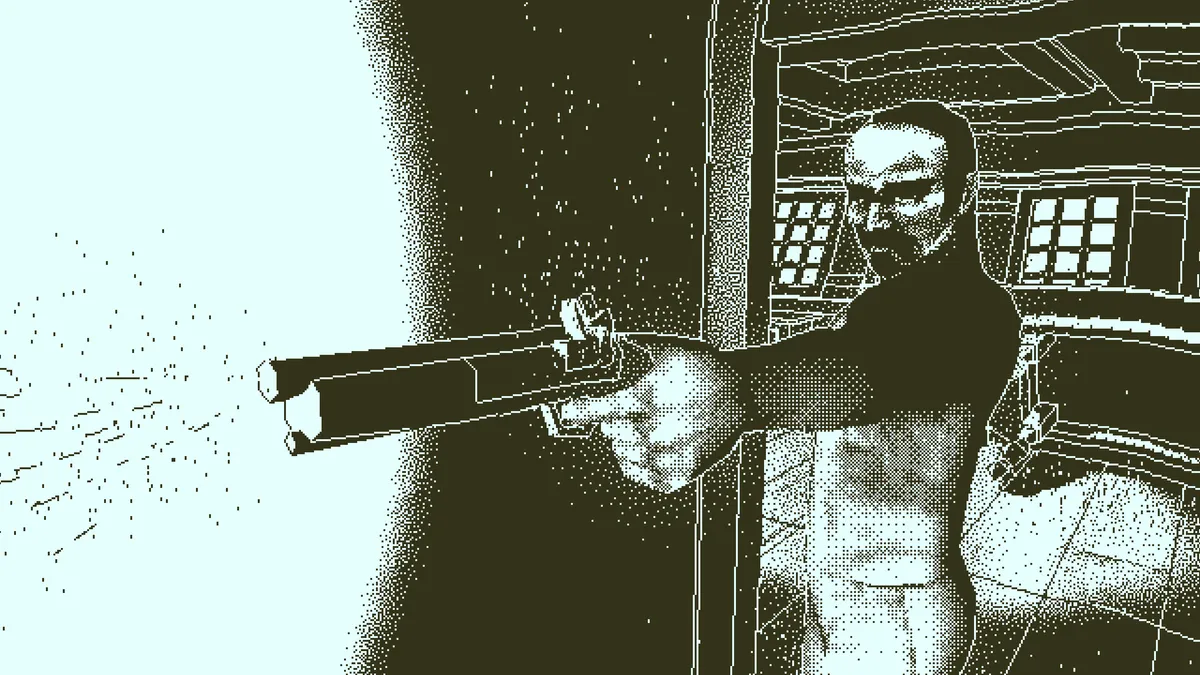
The look of Lucas Pope's Return of the Obra Dinn is an unlikely marriage of styles, a 19th-century high-seas catastrophe rendered with only the two color tones of early gaming computers like the original Macintosh. Obra Dinn casts you as an anonymous insurance investigator tasked with solving the identity and manner of death of the sixty crew members that disappeared from the titular vessel. Armed with a magical pocket watch, you find corpses and rewind to the exact moment of that poor soul’s death, be it from a falling cannon, a murderous crewmate, or even an attack from a supernatural kraken. But according to Pope, while the game's fill-out-the-matrices murder mystery conceit might be what catapulted it to critical acclaim, the aesthetic actually came first.
After the major success of the Papers, Please—an ever-relevant work-sim where you play a border guard who must determine which immigrants to let into your autocratic country—Pope had a strong desire to move beyond that game's bleak two-dimensional aesthetic back into the world of 3D. Working mostly alone, however, he knew that he couldn't compete with the high-definition visuals offered by larger studios with bigger budgets. So Pope decided to double-down and strike at a particular vein of nostalgia that had gone unnoticed by his competition.
My thinking was it would be easy, I could make a game with that artstyle in six months and then move on. That was totally wrong.
Lucas Pope
"When I sat down to work on Obra Dinn, I actually started with the visuals," he says. "I wanted to make a 1-bit, 3D game, because I grew up playing Mac Plus games. That 1-bit style—high-contrast, what passed as 'high-resolution' back then—was a technical limitation back then, of course, but it really stuck with me over the years. My thinking was it would be easy, I could make a game with that artstyle in six months and then move on. That was totally wrong. But once I had the visual style down, I had to come up with something to do with it."
One bit, twice the trouble
According to Pope, Obra Dinn started out with a very different concept. Instead of delving through still-life dioramas that depict the moment of a victim's demise, you would step into their waterlogged boots and live out the last minute of their life. If you failed to correctly reenact their method of death, the Grim Reaper would take your soul instead. While it was an intriguing idea—fellow indie hit What Remains of Edith Finch leaned on a similar concept—Pope figured out very quickly that it was far too ambitious, and he abandoned the idea in the pre-production phase.
Shortly after he started development on what would become Obra Dinn, Pope released a free demo that showcased the first few 'fates' that the player had to solve aboard the abandoned ship. As he recalls, it was only then that the fundamental strength of the game struck him like an oar over the head. Players didn't care that much about the manner of death—which was obvious enough in most circumstances—rather, it was the identity of the victims that gave them pause. That's when he realized the importance of the victim's face as an element of the game. (As Pope points out, in the final game, he made sure that that part of each person is always lit from the bottom, no matter the circumstance.)
"When you're developing a game as one person, you have a lot of advantages and a lot of disadvantages," he says. "One of the advantages is that you can afford to make a game for two years without even really knowing what it is, which is exactly what I did. One of the disadvantages is that you have to do something different visually to stand out. This means I have to solve all sorts of problems that nobody else has solved, at least recently. But I think that can be fun in its own right."
Since he didn't know anyone who had made the high-resolution 1-bit milieu he was going for, Pope spent months of development time trying to make sure that the environment was as "legible" as possible—basically, making sure that you knew what the heck you were looking at. While it might sound simple enough, Pope found midway through development that the chunky pixel artstyle made some playtesters physically ill in motion when they played the game at full-screen. Since Pope had designed the game assuming a windowed configuration—similar to the Macintosh games that inspired him—it made him reconsider his approach to "dithering," the visual technique that allows Obra Dinn to create the illusion of depth of shades out of the simple dots.

"The game always looked great in a window," Pope explains. "But when you take those black-and-white pixels and stretch them to the entire screen, your eyes can't fuse the dither pattern into shades anymore. In movement, it becomes a total mess.”
As explained in this forum thread, Pope tried a variety of techniques to bring a smoother sense of motion to the minimalist aesthetic, each focused on the tiled “dither pattern” that helps convert the game’s greyscale assets to the black-and-white 1-bit pixels. Eventually, he settled on a solution that warped the pattern whenever the camera moved, a process he compares to motion blur. “That became the game's 'smooth' output mode,” he says. “The 'sharp' mode doesn't do that, but since it's physically smaller, it's not much of a problem. That took me a long time to solve."
Though he fully admits that the games of his youth inspired the artstyle of Obra Dinn, Pope says he took great strides to make sure it didn't feel like he was simply mining for nostalgia. For example, at one point he considered adding a filter to make the game render as if on a CRT monitor, but decided against it, describing it as a "nostalgia too far." That's also why he decided to lean on the 19th-century music for the game's orchestral soundtrack, instead of trying to create some MIDI-ized chiptunes to really sell the retro angle.
"Several people have asked me that, why I decided to go with strings instead of chiptunes. For one thing, I wanted the game to have full voice-overs for the sake of the puzzles, so I felt that would clash with chiptunes. Plus, for me, the Mac Plus had an 8-bit DAC, so when I think old computer, I think 'samples.' I never wanted the old-computer shit to override the old ship-shit, basically."

While Obra Dinn has proved a massive success by the standards of the indie sphere, Pope admits that the game's lack of hand-holding and intimidating nature has made the game divisive among certain audiences. He says that the game isn't for everyone, and that there are some things about it that he wished he had done a bit better. Not on that list: the ability to fast travel from victim to victim, which is by far the most common complaint I've seen about the game online. "It's a complicated question," Pope says. "I feel like with fast-travel, you'd lose your sense of space on the ship, and you'd lose the shoe-leather element of being an insurance adjuster." That said, Pope remarks that Return of the Obra Dinn's striking look is the only thing about the game he's "unambiguously happy with."
"I chose the aesthetic because it stood out, but I also chose it because it's a good style if you want to obscure things, if you want to leave stuff out," he says." The lighting is very sharp, and it leaves a lot of detail out. For me, it's a benefit as a developer, because I don't have the bandwidth to put in all those details, but it's also a benefit as a player, because there's more empty space for them to fill in the blanks and imagine those details. For me, it's a lot scarier to see the silhouette of the creature, rather than all the details at once."