After calls that Marvel Rivals' end-of-match screens were barebones, and that's if we're being generous, NetEase finally upgraded the UI with the launch of Season 3.0. In fact, it was one of my favourite additions, finally letting me track my level, battle pass, challenge, and accessory point progress, as well as all the events that are always going on, without needing to head back to the menu.
Finally, the flow was uninterrupted—well, almost. Unfortunately, the end result was a bunch of end-of-match screens to flick through before being allowed to queue for another round. It only took a few seconds to spam through, but match after match, it certainly added up. Unsurprisingly, the community wasn't happy.
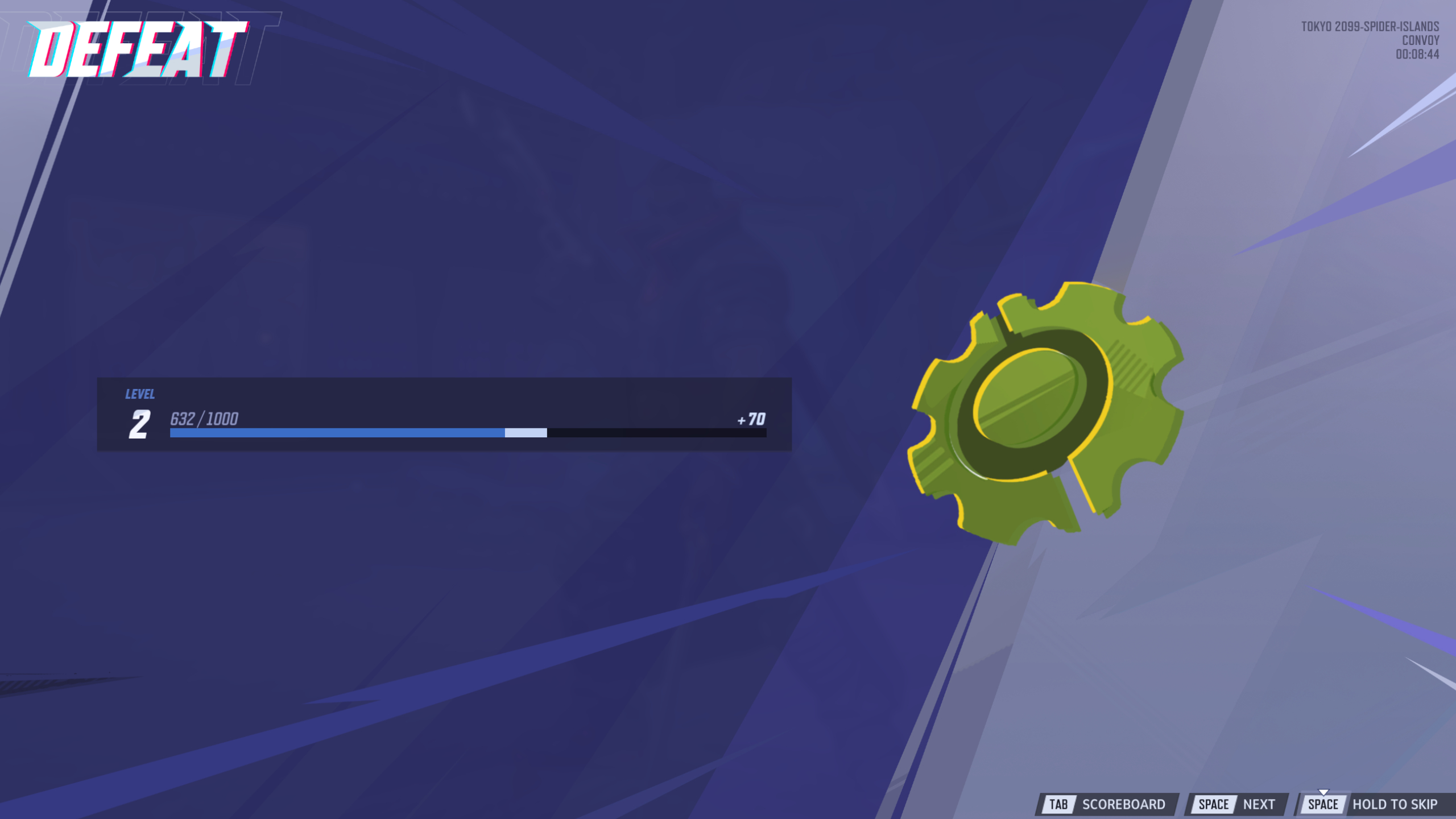
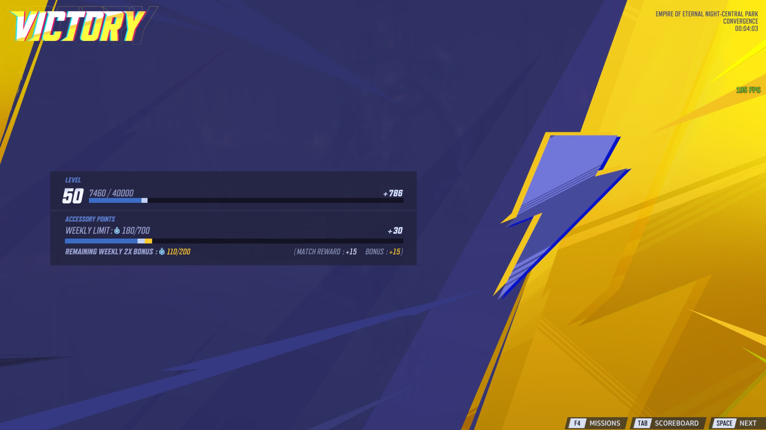
In response to this, NetEase has sneakily pushed through a change in Marvel Rivals Season 3.5 that addresses the issue. I didn't notice until after a handful of hours in the media preview build that you can actually now skip the end-of-match overview entirely. Why it's not mentioned alongside all the other changes in the patch notes or update blog posts is beyond me.
Article continues belowRather than mashing the spacebar and going through page by page, by holding the spacebar, you can jump straight to the old hero lineup screen to queue for your next match. I told you it was a small change, but it's exactly what was needed to have the best of both worlds.
Combined with the smoother battlepass and challenge systems introduced in Season 3.0, a lot of the hassle has been eliminated now. But there's still one UI issue that remains: the horrible hero selection screen. Sure, it looks "cool" having this curved character list on the right side of the screen, but it's also completely impractical, increasingly so. With each new character that gets added (now one every single month, remember), you have to scroll further and further down to find them.

NetEase is evidently aware of many of the UI shortcomings and is even finding ways to improve aspects that were already good, like having the hero portraits in the roster now use your equipped skin. So, here's hoping that the hero selection screen is next before I start Hulking out. Either overhaul it to be an admittedly less stylish but much more practical horizontal block of characters like other hero shooters, or add a favourites section at the top. The choice is up to NetEase, but for my sake, it had better pick one soon.
👉Check out our list of guides👈
1. Best gaming laptop: Razer Blade 16
2. Best gaming PC: HP Omen 35L
3. Best handheld gaming PC: Lenovo Legion Go S SteamOS ed.
4. Best mini PC: Minisforum AtomMan G7 PT
5. Best VR headset: Meta Quest 3

You must confirm your public display name before commenting
Please logout and then login again, you will then be prompted to enter your display name.