Valorant's boring characters are a feature, not a bug
Simple art makes Valorant a better FPS because its characters don't get in the way.
Valorant is many things, but a game drenched in originality it is not. The early conversations around Riot's shooter almost all revolved around comparisons to other games. Its weapon set is a purposeful reproduction of Counter-Strike: Global Offensive's mainstays (its big sniper rifle, the Operator ("Op"), is even a convenient homophone for CS:GO's AWP). The abilities are less busy and hectic than Overwatch. It exists in a crowded and narrow genre, but more than its peers, Valorant feels like a sum of its competitors.
At first glance, this lack of new ideas appears to extend to Valorant's characters. A green woman who attacks with poison named Viper did not take sleepless nights to create. Breach and Brimstone look like the same guy. Valorant’s newest agent, Killjoy, reminds you of Rainbow 6’s Korean hacker Dokkaebi, albeit with Valorant’s signature color splash. But where a game like Overwatch overflows with iconic, Pixar-like heroes with intricate backstories, Valorant’s cast feel like empty vessels wrapped around their abilities, personalities scooped out to make room for Shock Bolts. Overwatch, for comparison, has spawned a whole community based around the characters off the battlefield, and currently has close to 4,000 stories on fanfiction.com; Valorant has yet to inspire any. This seems even stranger when you compare it to League of Legends' sprawling universe, some of which is contained in an official lore page populated by short stories.
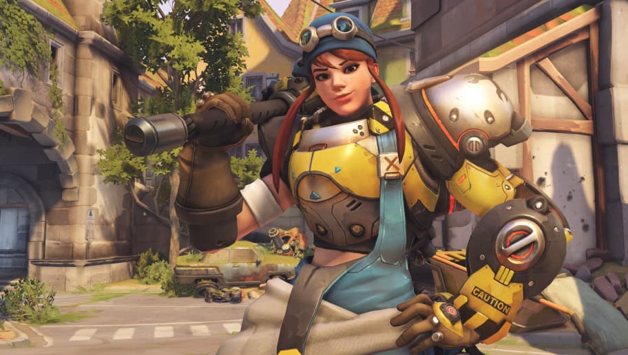
Valorant’s cast feel like empty vessels wrapped around their abilities.
But Valorant wasn't created to serve as fanfiction inspiration, was it? It was created to be the next generation of Counter-Strike (which, for the record, has several dozen fanfiction.net entries). Every inch of the game is deliberately designed to make this style of precise shooting as legible and straightforward as possible, including the otherwise uninspired art. While Valorant’s maps each have a unique gimmick—the teleporter on Bind, for example—the aesthetics in each map adopt a desaturated color palette mostly made up of flat grey and beige walls.
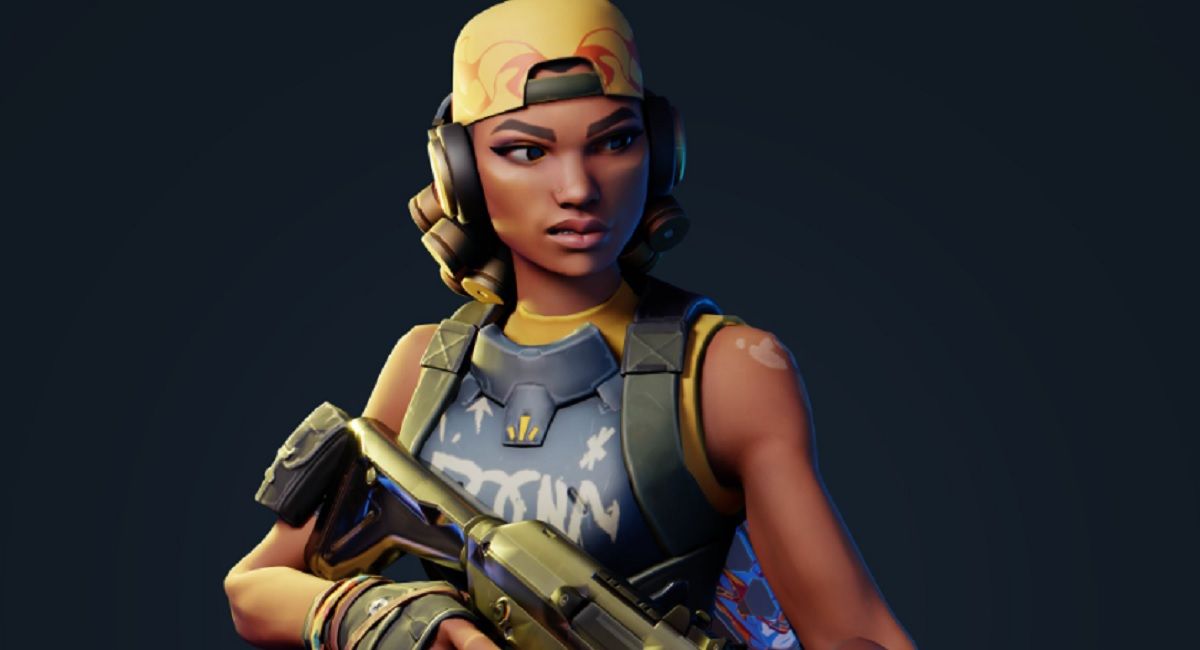
The characters, by contrast, are usually given one clear color to allow them to stand out against this slightly-muted backdrops. Viper is green, Jett is blue, Raze is highlighted by several bright flashes of orange, and new hero Killjoy is yellow. These simplistic designs have been criticized since launch, but what they lack in originality and creativity, they make Valorant's characters effective targets. You will not remember their faces or catchphrases for very long after you turn your PC off, nor will you rush to write fanfiction about Brimstone opening a cigar shop. But while you’re playing, you’ll know that every inch of the game has been designed for a smooth, uncluttered experience, where there’s no chance of an overdesigned comic book style character blending in with a hyper-imaginative building.
Region-neutral
This reined-in character design also offers Valorant a global appeal. While yes, from their accents, clothing, and menu text we can infer that Phoenix is from London, Reyna from Mexico, Sage from China, they don’t feel chemically engineered for any specific marketplace the way Overwatch’s have. Through seasonal event skins themed after events like the Olympics or Chinese New Year, Overwatch indelibly links its characters to regions, cultures, fanbases, and marketplaces. While Valorant has characters from around the world, so far their nationalities have only been expressed as surface-level details. Riot's decision to leave Valorant's story almost entirely unexplained at this stage is a conscious one; according to Riot itself the studio is more interested in aping Fortnite’s subtle worldbuilding. There is probably never going to be a major narrative to Valorant, never any reason to identify with its heroes beyond preferring one set of abilities over another. While this safe approach won’t birth any new multiplayer icons, it’s a good way to ensure your characters travel well across cultures.
Valorant is not the only shooter to focus strongly on character readability. Even as hats and custom cosmetics piled into the game, Team Fortress 2's simplistic red and blue color scheme kept its hero designs consistent, while creating a distinct look through character silhouettes. Moby Francke, the art lead for TF2, spoke about wanting the game’s artstyle to be “shape-driven [and] color-driven,” way back in 2008, which is similar to the simple aesthetics of Valorant’s green Viper or blue Jett (the airy attacker with a wavy ribbon attached to her hip). While Valorant highlighted these colors through a desaturated palette, Team Fortress 2 instead has distinctly warmer red areas and noticeably cooler blue areas, meaning there were sections of the maps which favored each team in turn. While the thought process behind the coloration is similar, Valorant has spun away from Team Fortress 2 when it comes to character outlines.
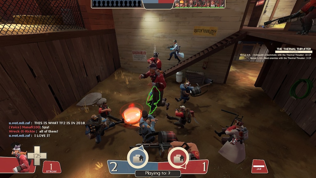
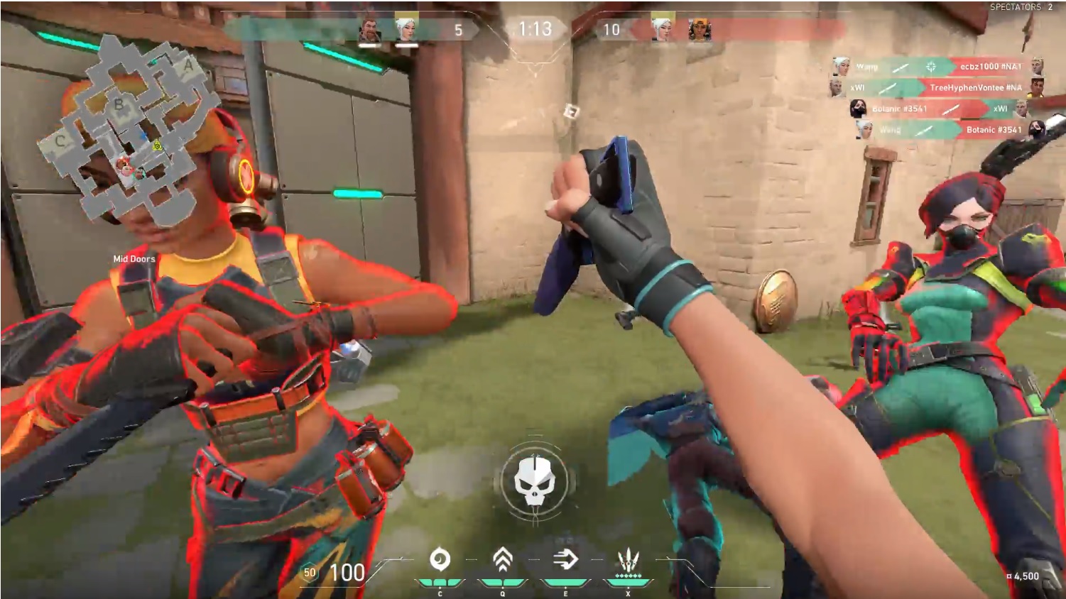
Team Fortress 2’s recognisable silhouettes were a big, deliberate choice. "We wanted very unique shapes; you can tell they have very different shoes and hats and clothing folds,” Franke said. Valorant, wanting similar hitboxes for competitive parity, hasn't made its characters dramatically different shapes, instead giving enemies a heavy red highlight across their edges, almost like a heat lamp is following them around at all times. The softer green glow allies are granted is less intense, but does its job: you almost never mistake a friendly for an enemy in Valorant.
Keep up to date with the most important stories and the best deals, as picked by the PC Gamer team.
Most other shooters come with much greater variety of character shapes than Valorant; in Overwatch, Winston has completely different hitboxes to Mei, while D.Va can go from her bubble mech to her jumpsuit mid-round. This range of hitboxes is all part of the tactical cut and thrust of Overwatch, and is something many longtime players consider one of the game’s biggest strengths. This does not inherently mean that hitbox variety is always a good thing, or that the absence of such variety is evidence of Valorant’s weaknesses. Respawn, on the other hand, struggled publicly to tune Apex Legends characters' hitpoints against their varying shapes post-launch. But by opting for consistency, Valorant again offers a hyper focus on ‘get-shot-ability’, reducing the reaction times needed to tweak your shots based on who you’re shooting at, making for a much more streamlined experience where the characters fall secondary to the robust gunplay.
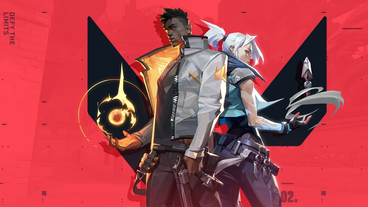
While Valorant follows most modern hero shooters in leaning away from TF2’s team uniforms, because of the small number of players, tighter, more tactical maps and increased color filter, team readability is much easier in Valorant than Overwatch.
Over time it'll be interesting to see how Valorant balances the business aspect of cosmetics with the need to put characters that are readable in a nanosecond on screen. Considering how many of its rivals go hard on making their trimmings stand out, Valorant has headed in a different direction, focusing on cosmetic weaponry (like their $100 dragon skin guns) rather than decking out their heroes with hats and incongruous skins. It’s a risk that actually elevates the still-teething game and offers it a unique niche: a shooter that isn't actually centered on its heroes.
