Baldur's Gate 3's color filters are a sore reminder that most color-blind accessibility options are still a total mess in games
I can't see clearly now.
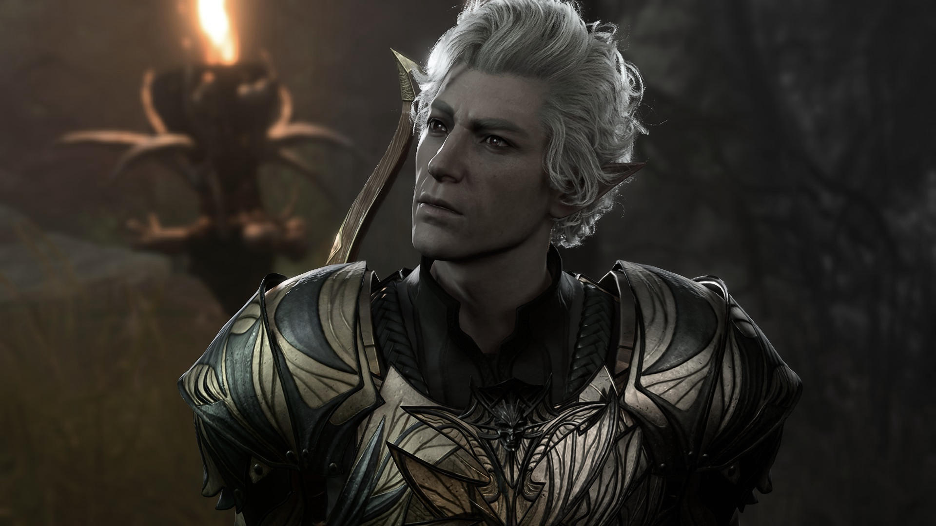
While accessibility options in games are by no means perfect—and often at the whim of a studio's budget or predisposition—they've certainly improved. However, one particular niche I inhabit is all over the damn shop: color blind settings. Baldur's Gate 3's fourth patch introduced some, and for me? They didn't really help.
But first, I'm going to dig into the wider issues with color blind accessibility and its implementation—and to do that, I need to get into how my eyes work (and what color blindness is like) for the completely uninitiated.
Color blindness can come in a lot of forms and severities. I have something called protanopia, or red-green colorblindness. In my particular case, I can still see red and green, it's just that my versions of those colors are a lot less saturated than for most people. For instance: I can typically tell the difference between green and brown, because browns tend to be darker than greens. Put a very dark green and a brown next to each other, however, and I start having trouble.
This is a huge pain in games, as both red and green are typically used to show off enemies and allies. In a busy first-person shooter, for instance, a red outline is barely visible to me. Devs address this problem with a mixed bag of tricks, and before I get into the failings of BG3's system particularly, I'd like to gripe about something I've grown to despise over the years—the color blindness filter.
Filter fatigue

There's a couple of different kinds of filter—one of these is what I like to call the 'full screen' or 'graphical' filter. These filters adjust the colors in the entire game world. I don't presume to speak for all eyes. These filters might genuinely help some of my fellow saturation strugglers—but for me, I have never found a single one of them helpful.
First off, they're usually an on or off switch. They either don't help at all, or they mess with the colors beyond the accommodations I actually need, even making certain colors harder to see. Secondly, I don't walk around with a color blindness filter in the real world—and trying to 'fix' that in a game just makes everything look downright alien.
The trees, sky, and earth I'm used to gawking don't look like this, and while the variation in contrast might help visual clarity, these filters usually rob games of their beauty. Here's an example in World of Warcraft—you should be able to see how dramatically everything changes.
Keep up to date with the most important stories and the best deals, as picked by the PC Gamer team.
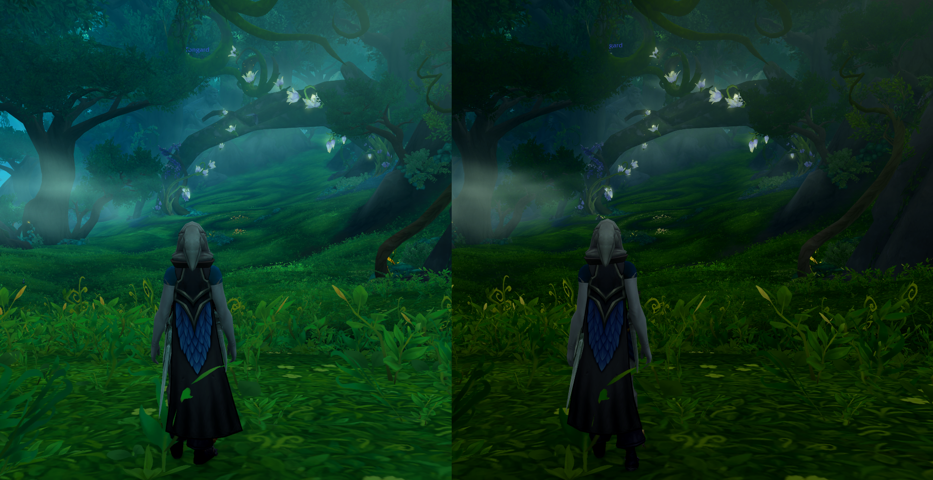
WoW does get points for allowing you to do this on a sliding scale. It also shows a color wheel that changes as you adjust your settings, letting you to tweak things to your liking. It's still not perfect, but it's better than a ticked box. I do have to dock the game points for the sheer amount of AoE markers (or 'swirlies') that you can't change the color of—even one of the best raiding guilds used a potion recently to help up the contrast.
The second kind of filter is a UI filter—one that changes outlines, character portraits, minimap icons, that sort of thing. And here we come to Baldur's Gate 3, a game I otherwise love, which has just kinda bungled it entirely.
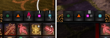
the filter doesn't even fix my protanopia-related issue—spell slots.
Unlike WoW, BG3 doesn't actually indicate what its color blindness filters are changing. Since said filters are accessed through a menu you can't rapidly adjust them to see what new information you're getting—additionally, there's no ability to tinker with the filter's intensity. This creates a one-size-fits-all approach to an accessibility issue where there is no one-size-fits-all solution.
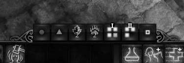
Perhaps the most frustrating thing about this filter, however, is that the it doesn't even fix my protanopia-related issue—spell slots. In BG3's UI, full spell slots are indicated by a white pip, whereas empty spell slots are indicated by what I believe is a pale red or pink. Even with the filter on, I still have to squint to tell the difference. If I desaturate the image completely, you can see the problem.
This is a game that I otherwise have a very high opinion of, but unfortunately I have to say that, as someone with protanopia, this filter is basically useless for me. Again, other players may have different experiences—but there are a couple of ways to design around the issue of personal vision that I feel should become industry standard.
Best practices (from a guy with busted peepers)

One great way to design around color blindness is to stop trying to fix the issue of color blindness at all.
Good color blindness design involves making UI elements that communicate things through both color and shape. You can also use highly contrasting values—very dark colors next to very bright colors—to improve visibility, or add noticeable audio cues like Sekiro: Shadows Die Twice does with its perilous attacks.
Maddeningly, this is something Baldur's Gate 3 does already—empty Warlock spell slots become grey, and if you have more than four of any spell slot, the display changes to a numerical one. This kind of design side-steps the problem entirely.
These sorts of solutions have a 100% success rate. Remove the reliance on color, and you cater to every color blind player's individual needs, it's that simple. But say you aren't designing around a UI element—what then? The slider in WoW I mentioned is a good starting point, but I'd like to call out an unexpected champion for good color blind implementation, Star Wars Jedi: Survivor.
You're able to go in and change the color for just about every important color-related signifier manually—your health, enemy's health, enemy highlights, auras that appear around interactable objects, the whole nine parsecs. You can even adjust the color of map icons to your liking.
Ultimately, though, since color blindness is so subjective—and such a difficult thing to explain to people—firing on all cylinders is the best option. Some combination of color-agnostic UI design and customizability will set up every player for success. It's important to have both, too—being able to adjust sliders to your heart's content is helpful, but removing the need to fiddle around is a huge benefit as well.
I can only cross my fingers and hope that Larian doesn't just leave the game's color blind filters in this state. While it's not so bad as to stop me playing the game, I worry I'll be cursed to squint at the bottom of the screen forevermore.
Baldur's Gate 3 guide: Everything you need
Baldur's Gate 3 tips: Be prepared
Baldur's Gate 3 classes: Which to choose
Baldur's Gate 3 multiclass builds: Coolest combos
Baldur's Gate 3 romance: Who to pursue
Baldur's Gate 3 co-op: How multiplayer works

Harvey's history with games started when he first begged his parents for a World of Warcraft subscription aged 12, though he's since been cursed with Final Fantasy 14-brain and a huge crush on G'raha Tia. He made his start as a freelancer, writing for websites like Techradar, The Escapist, Dicebreaker, The Gamer, Into the Spine—and of course, PC Gamer. He'll sink his teeth into anything that looks interesting, though he has a soft spot for RPGs, soulslikes, roguelikes, deckbuilders, MMOs, and weird indie titles. He also plays a shelf load of TTRPGs in his offline time. Don't ask him what his favourite system is, he has too many.

 Join The Club


