We used to be a society (with a good Windows Task Manager icon)
The latest Windows 11 Task Manager icon takes Microsoft's modern amorphous blob aesthetic to its (il)logical limit.

Keep up to date with the most important stories and the best deals, as picked by the PC Gamer team.
You are now subscribed
Your newsletter sign-up was successful
Want to add more newsletters?
Join the club
Get full access to premium articles, exclusive features and a growing list of member rewards.
Microsoft has delivered some blows to Task Manager in recent times. As noted last week by PC Gamer's Andy Edser, the Windows team recently stamped out a bug that granted Task Manager immortality. The sadly now mortal Task Manager has also suffering from an indignity for months that I have only just noticed: a crappy, Windows 11-ified icon.
I am generally ambivalent about Windows 11's aesthetic. The icons and menus are mostly uninspired but serviceable, blending in with 2020s corporate visual design in a manner befitting an operating system that's iterated itself into a state of near non-identity (AI will solve that problem, of course!).
The desire for, I guess, cohesive branding has hit some Windows icons harder than others. Every Microsoft Office application is now represented by an amorphous blob of color that suggests the vague idea of a thing. It's funny that a decade or so ago we were remarking upon the fact that the go-to save icon, a floppy disk, is a meaningless reference for young people. Now Microsoft has deliberately chosen to turn Outlook's icon into MC Escher's interpretation of an envelope.
Article continues belowTake that art history elective if you want to use Office, I guess!
As a Google Docs diehard I don't ultimately care about Microsoft Office, but I do care about Task Manager. Beautiful, beautiful Task Manager, perhaps the one purely functional bit of Windows that mostly just keeps getting better. This sensible application has long had a sensible icon: in Windows 10 and early Windows 11, Microsoft represented it with a light blue line graph on a blank background.
The spikes were easy to see, and easy to interpret as CPU performance.

Apparently, last year—I must really be behind on my Windows updates—that icon changed. And the new icon, though similar in intent, totally sucks. Two extra layers of lighter and darker blue turn it into an abstract topographical map.
Keep up to date with the most important stories and the best deals, as picked by the PC Gamer team.
In its most miniature form on my 1440p desktop, my brain can only interpret the new Task Manager icon as a vague pair of waves. Maybe a suspension bridge? I don't know man, it looks like a kid cut out some shapes from construction paper and glued them together for the school assignment "what does the ocean look like."
Here's the thing that really bugs me: it doesn't even make sense as a Task Manager chart anymore! If you pull up the Performance tab in Task Manager, you can look at a line graph of your CPU's utilization, or GPU's, or whatever, but each one is a distinct chart, because layering them on top of each other would be pointless visual chaos. Different things cause these graphs to spike at different times and to varying degrees. So even if you did overlay them—an option Task Manager does not offer!—it would look nothing like the new icon, which shows two layers following the same pattern.
The prior icon was nothing special, but it was inoffensive. The more I look at the new one the more it annoys me, in the same way Powerpoint's icon now being an orange paintball screams to me "we have lost the plot."
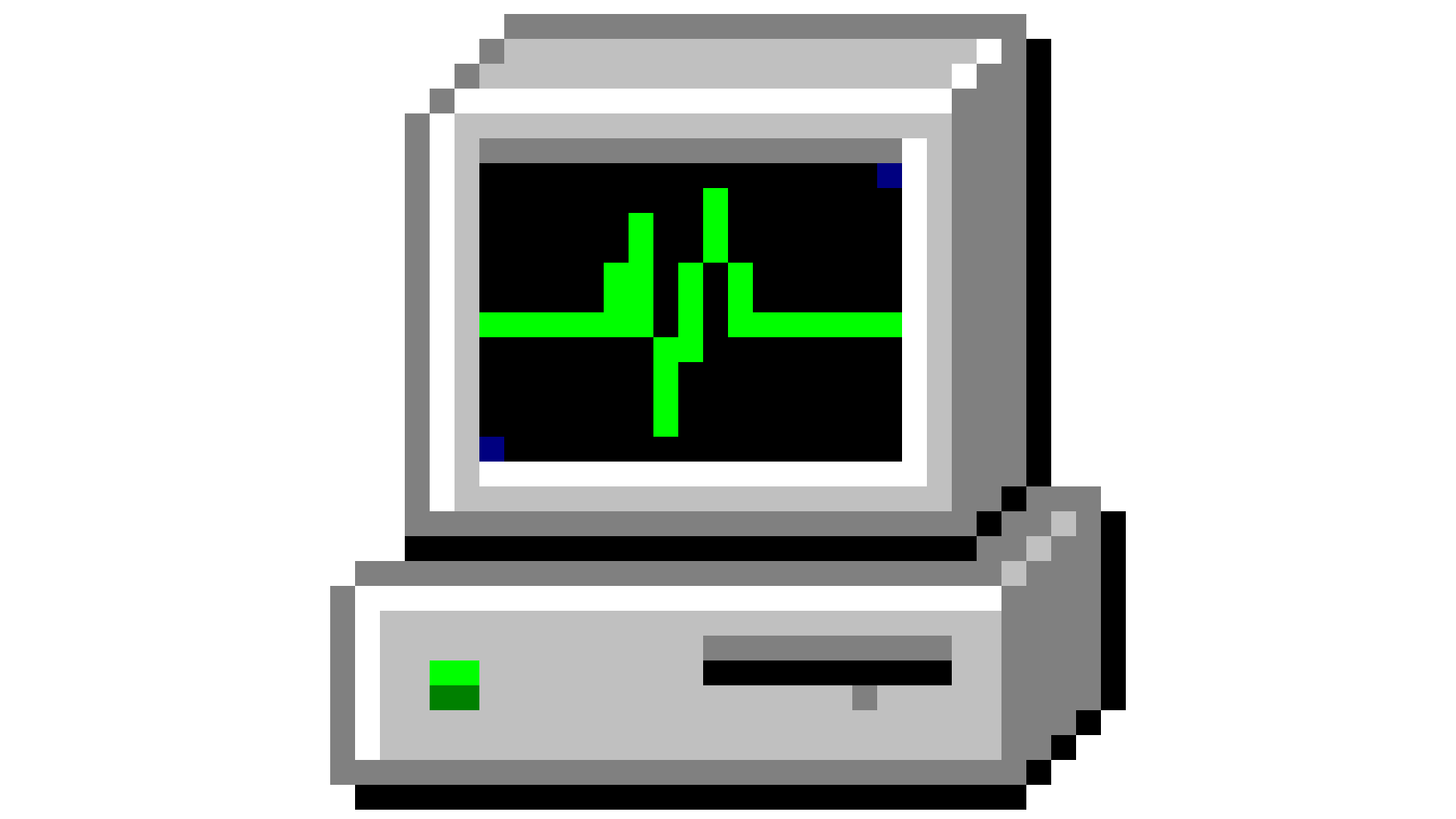
But there is a Task Manager icon I will go to bat for and proclaim as not just inoffensive, but great: the original, from the Windows 2000 and XP days.
Look at those beautiful, efficient pixels. It's like a heart monitor, but for your PC! That's sure a cute little computer with a chart on it, right there.
Windows used to be fun to look at. Now it desperately wants you to talk to it, even though everything it has to say back just reveals how incompetent it is.

Wes has been covering games and hardware for more than 10 years, first at tech sites like The Wirecutter and Tested before joining the PC Gamer team in 2014. Wes plays a little bit of everything, but he'll always jump at the chance to cover emulation and Japanese games.
When he's not obsessively optimizing and re-optimizing a tangle of conveyor belts in Satisfactory (it's really becoming a problem), he's probably playing a 20-year-old Final Fantasy or some opaque ASCII roguelike. With a focus on writing and editing features, he seeks out personal stories and in-depth histories from the corners of PC gaming and its niche communities. 50% pizza by volume (deep dish, to be specific).
You must confirm your public display name before commenting
Please logout and then login again, you will then be prompted to enter your display name.
 Join The Club


