Scythe is a great board game, but the PC version needs sharpening
Lackluster interface and a plethora of small missteps characterize the beta.

Scythe was one of the real standout board games of 2016, marrying a strong strategy game engine with Jakub Rozalski’s beautiful and fascinating world of 1920+. It’s the kind of strategy game you can get wargamers and more abstract strategists to play, with an emphasis on not just map control and conflict, but also on strategic economics. Unfortunately, the now-available closed beta of Scythe on PC doesn’t look so good. While it preserves the original game’s mechanics in full, a number of user interface and presentation errors make it hard to recommend right now.
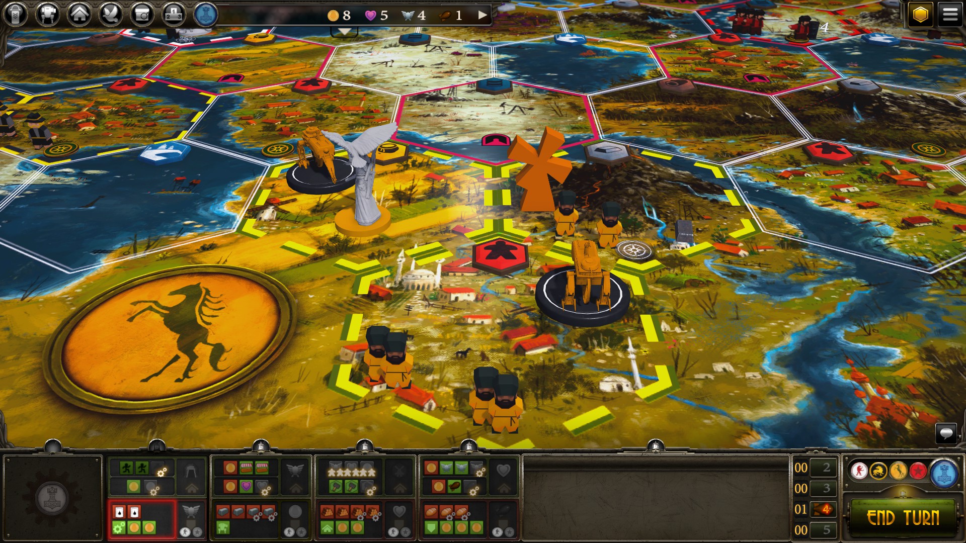
The bones of tabletop Scythe are here in full. You’re a ripped-from-alt-history power like Polania or Rusviet vying for control in the fictional region of Eastern Europa at the end of a great war. In this world, an advanced city-state called The Factory fueled the war with mechs and advanced technology, but now lies silent at the heart of Eastern Europa. Each turn, you choose to take a series of actions such as moving units and then constructing buildings, or harvesting resources and then deploying a mech. These actions come in sets with costs based on a random specialization like industrial or agrarian—the second half of your player identity behind faction. Much of the overall strategy is optimizing these actions for an effective economy, ensuring that you can both move and have the resources to build a building so that none of your turn’s potential is wasted.
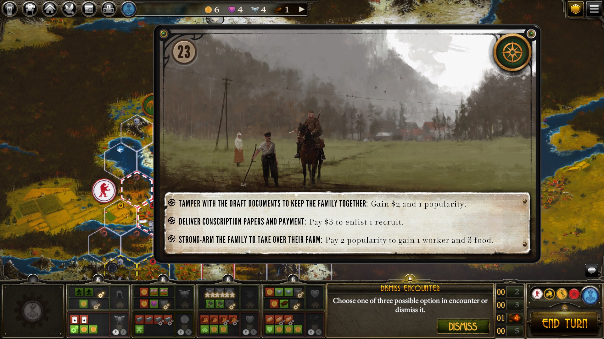
Discarding the very readable player mats used in the tabletop game, the digital edition opts for simplified action icons without text labels, meaning you have to click on one to read its text if you forget precisely what it is or how it operates. There are no tooltips to shorten the process, either. Checking yours or your opponents’ resources, including how close you are to victory, is equally annoying. You need multiple clicks to expand a large menu that blocks the top of the screen. The user interface fits awkwardly in the vast majority of PC aspect ratios, wasting valuable screen real estate everywhere. It reads like a design for mobile that was simply scaled up in size for PC.

That’s not to say all the design is bad. Your faction powers, secret objectives, and victory information are tucked away in convenient buttons in the top right—neatly out of the way for normal play, conveniently accessible if you forget what you’re up to or need a refresher.
There are other, less egregious user experience flaws, but they’re all still worrisome for a game that claims to be releasing this quarter. The UI lacks prompts or warnings, happily allowing you to skip your action or part of your turn entirely. It’s a bane for new players, who, under-tutorialized, can simply charge ahead with the “next action” button and do nothing because they didn’t know they had to go click two tiny tech buttons or go to the map and resources there to spend them.
Right now, the best way to learn to play this version of Scythe is to read the tabletop rulebook. Yet most players come to a digital edition either brand new or hoping for something that will remember and enforce the game’s rules for them. I can happily play Scythe by myself on the tabletop—it has great single-player modes—if I want to do all the work.
The AI is also not quite up to snuff, miserably inefficient and seemingly incapable of grasping the basic strategy. It wastes its combat power on battles, hoards resources it doesn’t need, and expands its population unsustainably. (Now that I put it in writing, that’s actually much like a real human civilization.)
Keep up to date with the most important stories and the best deals, as picked by the PC Gamer team.
Scythe: Digital Edition is still in beta, and though there isn't much time before release, hopefully all this is cleared up before it launches this quarter. It’d be a shame if a great board game were ruined for PC players by a bad port.
Jon Bolding is a games writer and critic with an extensive background in strategy games. When he's not on his PC, he can be found playing every tabletop game under the sun.

