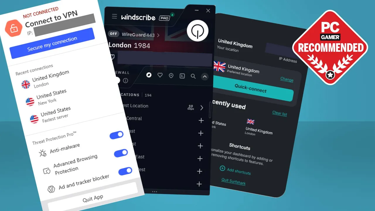
 Join The Club


Rob Zacny gathers his troops in our monthly Tactical Advantage column to examine the complexities of strategic gaming and development. This month, Rob explains how pretty visuals don't necessarily make a better strategy game.
A PC upgrade can make everything feel new again, even something as minor as using Microsoft Word. I'm giddy at how much information my new 27-inch monitor can display. With enough desktop space to write in one window while others show me sources and chats with editors, I feel like the world is at my fingertips. I wish strategy games gave me that feeling more often, since they actually do put a world at my fingertips. Too often, strategy developers take the wrong approach to visual design and misplace their priorities when it comes to graphics.

Take a game like Combat Mission: Battle for Normandy, where developer Battlefront.com clearly poured considerable effort into their detailed models—you can literally count the rivets on a German Panther tank. But details like this don't show me what I need to see: elevation changes, patches of dense foliage, and which units are in trouble. Combat Mission tries to offer wargamers some eye candy, but it leaves them starved for the kind of information that could streamline play. That's a recipe for recurring frustration in a game with so many moving parts, where battles can turn on the smallest of details.

The master of excellent visual design is, of course, Relic. Most strategy games can't approach the beauty (or budget) of games like Company of Heroes and Dawn of War II, but it's not the polygon counts that make Relic's visuals so great. It's how much they communicate, even resorting to comic-book touches like a “!” over the heads of broken troops, or a flashy overlay showing that someone just tossed a grenade. Troops fight with distinguishable weapons and expressive animations that broadcast what each unit does and how it's faring. Before I even glance at the info panel, I have tremendous situational awareness.

Not every developer has such a fine understanding of what players need to see, much less how to show it to them. Paradox, in particular, has struggled with visuals in games like Victoria II and Sengoku, where looking at a map doesn't show what's actually happening. Take Sengoku, a game of dynasty building in feudal Japan: three-quarters of the screen are given over to a map, but the real battlefield is one of family ties and feudal obligations. Territory is just a way of keeping score, yet the map dominates the display while crucial information is confined to a series of cramped, unhelpful windows. In a game all about lineage and lieges, Sengoku doesn't include a single family tree, nor an easy way to see who owns what on the main map.
Strategy developers need to think holistically about visual design. Art and animations aren't eye candy—they're the thousand words that will do the heavy lifting for the interface. When my girlfriend asked what was going on in my Tropico 4 game, I was able to take her on a tour of my island and explain to her exactly what was happening and why. Visuals told most of the story. Here was a crowd around a protester, and over there was a packed beachfront restaurant. In a few places, I would open a window just to show her a little more detail, like why the protester was angry, or why my tourist town was doing so well.

During a tense battle for succession within Sengoku's Clan Shimazu, my girlfriend brought me up short by asking the same question. I looked at the screen, but there was nothing that could illustrate my situation. Like many strategy games, Sengoku relies on spreadsheets, vague icons, and a plethora of map overlays to communicate fragments of information. The player's job is to assemble those data shards into a picture of what's happening. This leads to one of the greatest frustrations for a strategy gamer: the knowledge that no matter what you're looking at, there's probably something else you need to see.