The best alternative Team Fortress 2 HUDs

We all love a game of Team Fortress 2. But do you love the default HUD? It's colourful and fun, sure, but do you think it could be improved? For those players who might find the default slightly distracting we've searched to find you the best alternatives. Read on to find out what they are, where you can find them, and why you should be using them.
1. PVHUD
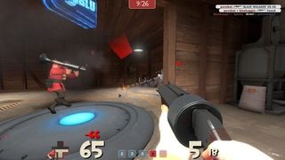
PVHUD is by far one of the most popular HUD mods in the community. Mention user-created HUDs in a Steam forum, and it wont be long before someone points you in the direction of this little guy. PVHUD is all about immediacy; the components are pulled towards the centre of the screen, made big and simple, and just tell you how it is.
2. Broeselhud
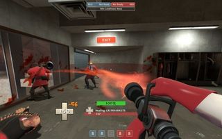
The Broesel HUD is a nice balance of an immediately recognisable format but made minimal enough as so to be less distracting. It brings the components to the centre of the screen, just below the cross-hairs and removes the character portraits from the health bar. The icons are smaller than those in PVHUD, meaning more of the screen is available to view the game through.
3. Oxide
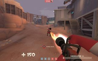
Oxide is a HUD for those looking for a more competitive edge. The aim of the mod is to reduce the HUD to only the complete necessities. Health, ammo and special abilities counters are reduced to small, unobtrusive icons. The who-killed-who blog is reduced to barley anything. Hell, even the menus are reduced to simple lists. It eliminates the flamboyancy of the original, giving you only what is needed to own like a pro.
4. Flame's TF2 HUD
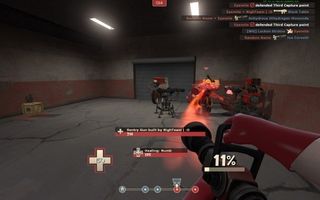
This HUD is once again a minimalist's HUD, but does it with a significant degree of polish. Where some other HUDs are clearly user made, Flame's is so well designed it looks like an original. Featuring centralised components, a slickly designed objective tracker and maintaining that disticnt 'TF' feel, Flame's TF2 HUD is one for serious consideration.
5. FrankenHUD
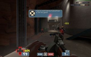
Why choose one HUD when you can have them all? That's the philosophy of FrankenHUD , which combines all the great touches of other popular HUDs and combines them into one mega HUD. You've got your minimalist pop-ups, your merged payload objective bar, your Steam avatars in the chat indicator and a snazzy little window to select your class from rather than the line-up screen. Combine that with easy read icons, and you've got a winner on your hands.
Installing a new HUD is simple. Head into your Steam directory (Program Files/ Steam/ steamapps/ [your username/ team fortress 2/ tf2). In the tf2 folder you'll find a small group of folders, two of which will be called 'resource' and 'scripts'. When you download the HUD files, open the file (you may need a RAR extraction tool if you don't have one already). Inside you'll find 'resource' and 'script' folders. Simply replace the ones in your 'tf2' folder with the new ones, and you've set up your new HUD. It's probably a good idea to make a backup of the original 'tf2' folder before you start tinkering with it, so you can revert back to original settings if you change your mind.
PC Gamer Newsletter
Sign up to get the best content of the week, and great gaming deals, as picked by the editors.
Which are you favourites? Let us know how you get on in the comments.
Most Popular


